
Jamu
Designing Healthcare Trust: A Brand as Serious as the Work
Building a clinical, offline-first AI brand identity for healthcare workers across Africa.
Role: Brand & Identity Designer
Deliverables: Logo system, design system, core app UI
Context: AI clinical documentation platform for healthcare workers across Africa
Key Constraints: 100% offline, bilingual (EN/FR), field-and-hospital ready
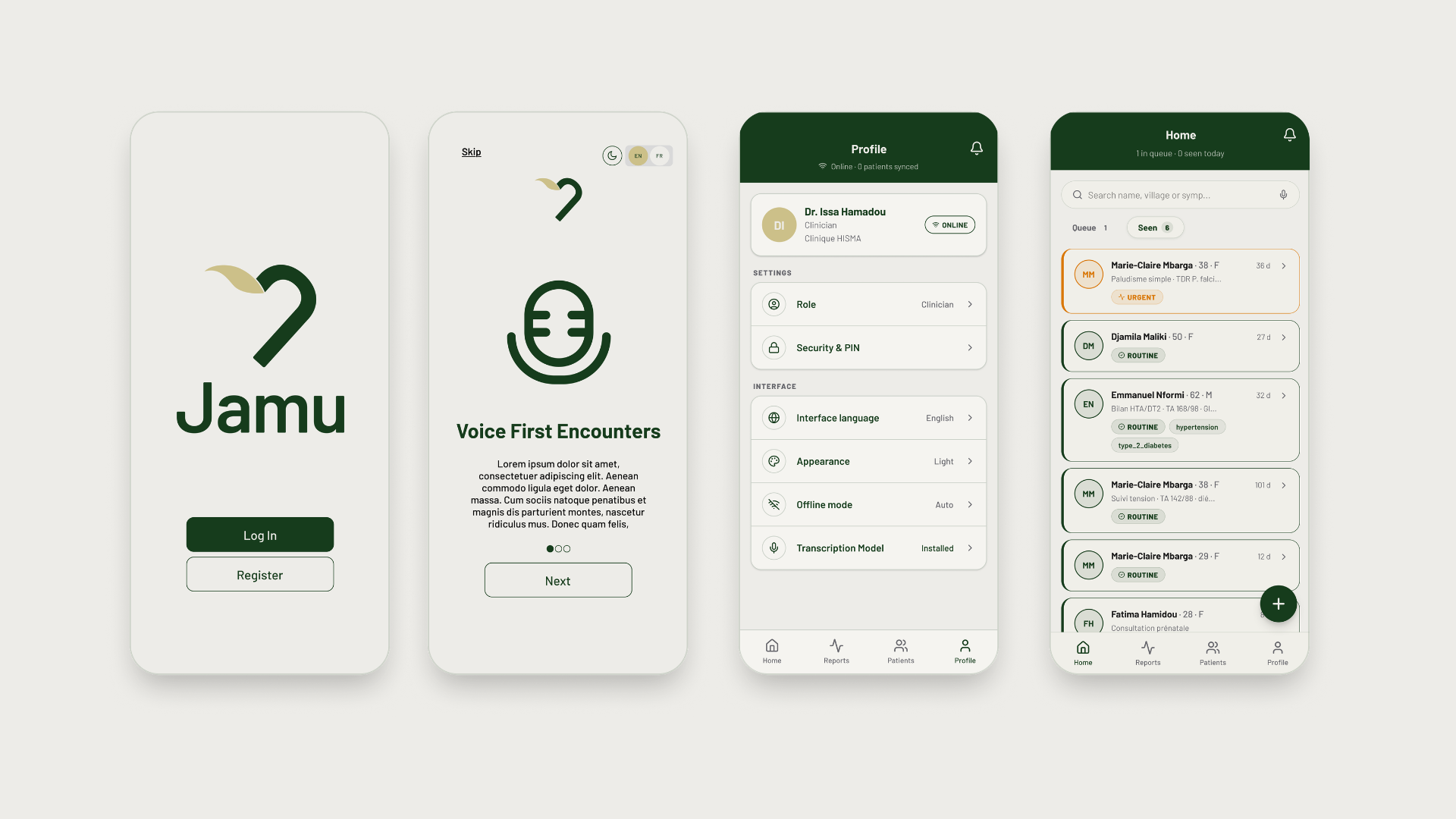
Jamu is an AI-powered clinical documentation platform that turns dictated patient visits into structured SOAP notes — built for environments where lives depend on the documentation being right. My job was to give that seriousness a face: an identity that commands authority in front of ministry directors while staying warm enough for a community health worker on a dusty field visit.
Jamu is an AI-powered clinical documentation platform designed for healthcare environments across Africa. Clinicians dictate patient visits, which Jamu automatically structures into accurate SOAP notes.
The word "Jamu" comes from Fulfulde/Pulaar, signifying wellbeing, serenity, and peace. Our goal was to create an identity that carries this cultural weight with quiet confidence — without feeling heavy-handed.
Core Realities & Operational Constraints:
Healthcare Critical: Lives depend on clear documentation; clinical accuracy is non-negotiable.
100% Offline: Built for power outages and remote field work where connectivity drops.
Field & Hospital Ready: Must command authority in front of ministry directors while remaining warm and approachable for community health workers (CHWs).
Bilingual Flexibility: French text runs ~30% longer than English, requiring generous container widths and flexible optical spacing.
The Challenge
To build trust at every level, the brand had to balance four distinct visual contradictions:
Trustworthy vs. Warm: Authority for institutional directors; approachability for frontline health workers.
Clinical vs. Human: Serious life-saving utility without corporate sterility.
African-Rooted vs. Globally Credible: Culturally authentic without relying on tired visual clichés or purely decorative motifs.
AI-Powered vs. Never Cold: Technological confidence without sci-fi tropes or neon gradients.
Holding Four Tensions at Once
We resolved these tensions through restraint rather than decoration. The mark centers around three intentional layers:
01. The 'J' (Care): A bold, rounded 'J' that hooks inward, forming the right side of a heart.
02. The Heart (Humanity): Mirroring the letter completes an invisible heart—reminding users that documentation is an act of care.
03. The Leaf (Trust & Nature): A gold leaf referencing herbal heritage and health, adding vitality and lightness to the mark.
From Concept to Mark



What Was Delivered
Logo System: Primary mark, wordmark, dark mode variants, and responsive app icons (down to 20px).
Design System & Style Guide: Full color tokens, typography scale, and Lucide-based icon guidance.
App UI Execution: Onboarding, facility selection, and clinical queue screens.
Impact
A mark that works at every scale: from a 20px app icon to a full brand deck, without losing legibility or meaning.
A visual language ready to scale: dark mode, iconography, and UI components built to extend as Jamu adds features.
An identity that earned trust on both ends: authoritative enough for hospital directors, warm enough for frontline health workers.