
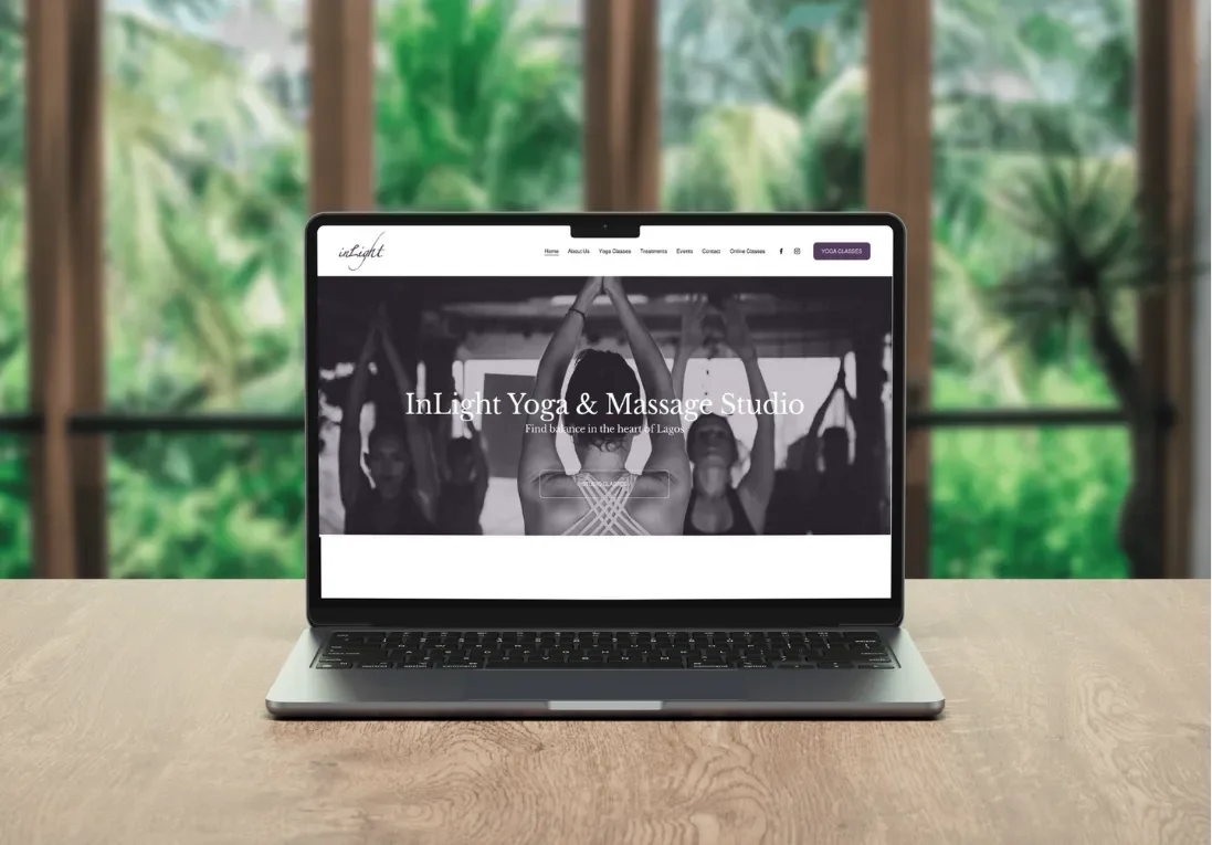
Designing spaces for inner clarity and community.
Reclaiming Brand Identity and Fixing Critical UX Flaws
The initial website build failed to capture the studio's actual essence and created friction at every turn:
Dense, heavy-dark layout that clashed with the studio's calming, premium wellness brand
Broken service navigation paths, including dead links landing users on 404 pages
Cluttered, hard-to-scan class schedule
Hidden or buried service descriptions
The objective: completely restructure the platform: strip the visual clutter, fix the broken architecture, and design an intuitive, minimalist digital home that actually mirrors the studio's peaceful, high-end experience.
The Challenge
Before vs. After
A heavy, cluttered design that misaligned with the brand identity, plagued by technical issues like broken service menus and frustrating 404 navigation errors.
The Solution
A minimalist, light-filled redesign focused on effortless navigation. The architecture was completely rebuilt to ensure a smooth, reliable user journey that makes services easy to explore and understand.

Liana made a beautiful website for my yoga studio. It is clean, clear, easy to navigate and visually captures the essence and atmosphere of our studio perfectly. She also designed our massage brochure, yoga schedule, business cards and social media templates so it all now matches and looks great together as an all round presentation of us. Liana is a lovely person. She is attentive to the visions and wants of her clients, stays in close communication during the design process and is very professional and easy to work with. Thank you!!
-- Studio Owner, Asa at InLight Lagos
The impact so far
3,367 Class Schedule page views - the most-visited page on the site, ahead of even the homepage
7,784 Total site visits (6.9K unique visitors)
9,167 Total pageviews
1,148 Treatment page views
→ The schedule page outperforming the homepage isn't just a traffic stat — it's proof the redesign removed the friction between a visitor landing on the site and actually finding a class to book.
The User Voice: Identified Friction Points
To understand why the previous site struggled with conversion, I gathered feedback directly from active users and studio visitors.
User Critique by Studio Team Member (anonymous)
“Page loads longer than pages normally load… typographic hierarchy could be considered with more subtlety and UX in mind… icons are thrown in without any meaning.”
“You can straight away see where AI was used. I personally wouldn’t use any of AI pictures.“
User Critique 2 by a client (anonymous)
“The Healing Massage is now called Chakra Healing Meditation… as most people who book it really want a massage, it might be a bit misleading now to call it a Meditation.”
Client raised the same concern about “Energetic Clearing & Empowerment” being renamed “Mindfulness For Stress Relief” — noting it obscured what the treatment actually was.
What I changed:
Reverted treatment names to prioritize clarity over cleverness — a reminder that in service-booking flows, findability beats branding when a client is scanning a menu to book the right session.
This became a broader principle applied across the schedule and treatment architecture: name things the way the customer thinks about them, not the way a marketer would.
She also flagged a cross-device bug — the redesigned site was only rendering correctly on mobile, not desktop — which fed directly into a QA pass before full launch.To understand why the previous site struggled with conversion, I gathered feedback directly from active users and studio visitors
What This Feedback Taught Me
Two patterns emerged that changed how I approach client-facing design work going forward:
AI-generated assets need the same scrutiny as any other design decision. They can look “good enough” in isolation but fail immediately under real user (or teammate) scrutiny — especially for brands where authenticity is the product.
Naming and IA decisions should be validated with the people actually booking, not just aesthetic instinct. A name I thought was more evocative was, to an actual client, less clear — a small but telling reminder that clarity usually wins over cleverness in transactional flows.
Project Scope & Effort
Digital Strategy & UX Design
1
Website Redesign Consultancy: Audited the failing platform, diagnosed user friction points, and established the strategy for a light-filled, minimalist digital identity.
UI/UX Design: Designed a completely new, responsive layout focused on whitespace, elegant typography, and effortless navigation.
Information Architecture: Rebuilt the site structure from scratch to eliminate broken links (404 errors) and ensure a smooth, reliable user journey.
Technical & IT Infrastructure
2
Technical Advice: Consulted on hosting upgrades, privacy protocols, and digital performance scaling.
Domain Transfer: Managed the secure migration of the studio's domain to a high-performance registrar with zero downtime.
Email Setup: Configured and authenticated professional business email accounts to secure reliable deliverability.
Content & Growth Marketing
3
Content Preparation: Structured and formatted all service descriptions, class details, and copy for maximum clarity.
Search Engine Optimization (SEO): Implemented core on-page SEO, optimized metadata, and established local search targeting.
Platform Maintenance: Set up an ongoing maintenance workflow for schedule updates and content management.
Tangible Brand Assets
4
Print Production Layouts: Designed a cohesive suite of high-end print materials, including the studio Brochure, Poster, Class Schedule, and Business Cards.
Social Media Templates: Created a library of editable, minimalist digital templates to align the studio’s social media feeds with the new website aesthetic.