Designing for Wellbeing
A Human-Centered Approach to Jamu's Brand Identity
Starting from the user, not the interface
When Jamu's founder came to me with a placeholder logo and a real problem, the brief was clear about one thing above all else: this brand had to work for people who don't have time to think about branding. Clinicians and nurses in busy hospitals. Community health workers moving between rural villages with a low-end Android phone and, often, gloves still on. People whose job is to act fast, because in healthcare, speed and clarity are not nice-to-haves — they can be the difference between a patient being seen properly or not.
That reality shaped every decision in this project. Not "what looks impressive," but "what disappears into the background so the real work — caring for a patient — can happen without friction."
Designing for the moment, not the demo
It's tempting, especially with an AI-powered product, to reach for motion, gradients, glowing "AI" cues, futuristic flourishes — the visual shorthand that says look, technology. I deliberately avoided that path.
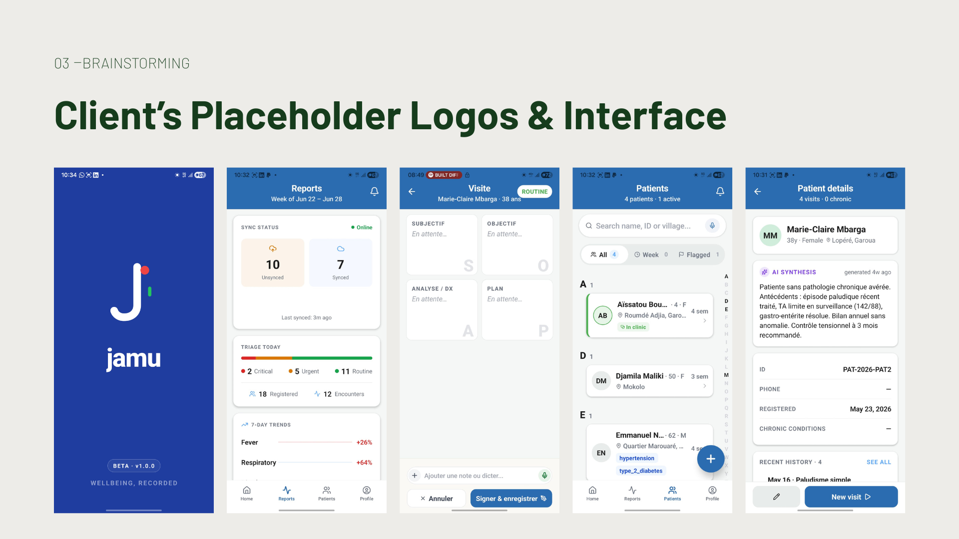
A nurse mid-shift doesn't need an app that impresses her. She needs one she doesn't have to think about. So the entire visual system was built around restraint: large tap targets for gloved hands, high-contrast color for outdoor and low-light clinic conditions, no loading spinners that imply a connection the app doesn't need, and typography that stays legible whether she's reading in English or in French, even though French text runs meaningfully longer and has to fit the same small screen.
None of this is decorative thinking. It's the opposite. Every constraint came directly from how the product is actually used: offline, outdoors, under time pressure, by people with more urgent things on their mind than a UI.
Simplicity as a form of respect
Minimalism, in this project, wasn't an aesthetic choice — it was a form of respect for the user's time and attention. Health workers don't need interactive flourishes or novel patterns to learn. They need something intuitive enough that the first time they open it, it already makes sense.
That's why the product itself stayed close to its existing, tested flows — the goal was never to reinvent the UX, but to give it a coherent visual language that reinforces trust rather than distracts from the task. Cards, search, clear hierarchy, generous spacing, one consistent type system across five weights. Nothing asks to be figured out. Everything is where you'd expect it to be.
The logo: where the idea had to live in the letterform itself
The hardest part of this brief wasn't the color palette or the typography. It was compressing everything the brand needed to say into a single mark that a busy person would glance at for half a second, at most.
Jamu means wellbeing in Fulfulde/Pulaar — a word carrying real cultural and emotional weight. The challenge was translating that weight into something that felt light, modern, and completely unforced. Not a literal illustration of "wellbeing." Not a cliché. Something that would hold up next to a hospital director's letterhead and still feel human to a CHW checking her phone in the field.
The answer came from the letterform itself, built in three deliberate layers:
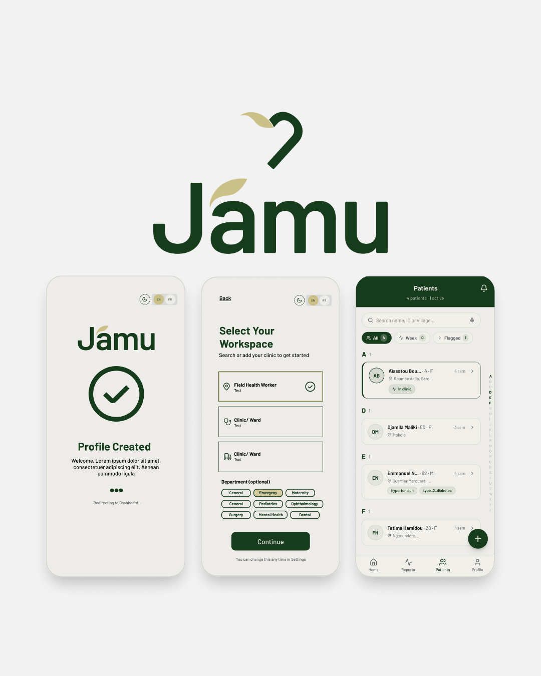
The J, redrawn as an act of care. The mark starts as a bold, rounded J for Jamu. But the base of the stroke curves inward rather than finishing straight — turning the letter into the right half of a heart. That's not an accident of style; it's the core idea of the brand made literal. Every clinician documenting a visit is, in a very real sense, performing an act of care. The letterform carries that truth quietly, without spelling it out.
The heart, revealed by mirroring. Mirror the J, and a complete heart appears. I built this so the logo would carry a message that isn't loudly stated anywhere in the brand — that clinical documentation is not paperwork, it's human care. It's a small, hidden layer of meaning: most people won't consciously register it, but it's there, shaping how the mark feels even if they can't say why.
The leaf, for what "jamu" is rooted in. The final layer is a soft, gold leaf resting where the two curves of the heart meet. It nods to the herbal, natural roots of the word "jamu" itself, and gives the whole mark warmth and a sense of life — without slipping into visual clichés like patterns or literal botanical illustration, which the brief specifically asked me to avoid.
Three decisions, one mark — and every one of them earns its place rather than existing for decoration. That was the standard I held the whole identity to: nothing in this system exists unless it's doing real work, either functionally or emotionally.
Color and type, held to the same discipline
The palette follows the same logic. Forest green carries almost all of the visual weight — serious, grounded, trustworthy. A muted, earthy gold — pulled directly from the leaf in the logo — is reserved for accents and interactive moments, so it stays meaningful instead of decorative. And instead of clinical white, the background is a warm "bone" tone: healthcare defaults to white because it reads sterile, but Jamu needed to read human, and the warmth also happens to reduce glare on cheap screens in bright outdoor light. Orange exists in exactly one place — urgent alerts — so it never loses its power to signal genuine urgency.
Typography follows one typeface, Barlow, across five weights, chosen specifically for its geometric clarity and how gracefully it absorbs the ~28% length increase of French text without breaking the layout's rhythm.
Why this matters
It would have been easy to make Jamu look like a typical AI health-tech product — cool tones, a sparkle icon, some motion, a sense of "innovation." But that's not who uses this app. The people relying on Jamu every day are doing exhausting, essential work in demanding conditions, and the last thing they need is a brand asking for their attention.
Good design for a product like this isn't about being noticed. It's about being trusted instantly, understood instantly, and then getting out of the way. That's the philosophy behind every choice in this identity — from the logo's hidden heart down to why the background isn't quite white. Design in service of the person actually doing the work, not the person looking at a portfolio.
That, to me, is what human-centered design means in healthcare: designing so quietly and so well that the user never has to think about the design at all — only about the patient in front of them.